CUSTOMER SERVICE WORKBENCH HOME PAGE
REDESIGN
Role
Design Owner/Solo/UX Designer
Highlights
Self-driven/On-site research
Duration
10/2022-12/2022
BACKGROUND
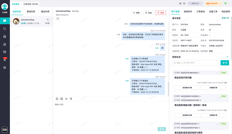
CUSTOMER SERVICE WORKBENCH HOME PAGE REDESIGN is a critical system for customer service staff, facilitating online communication and issue resolution with consumers.
Q3 research indicates low user satisfaction, only 70%. Besides, there were multiple experience issues that urgently require design intervention.
DESIGN PLAN



CONDUCT RESEARCH




PROBLEMS
Main pain points could be summarized to 4 parts, corresponding to the 4 core modules of the system: navigation, incoming list, chatting area, support area.
Once the 4 parts be given a new look, the user experience could be more effective and smooth.

🛠 4.Support area
Information & functions scattered in 5 tabs
👶 2.Incoming list
Inefficient tab switching & risks of ignoring
💬 3.Chatting area
Visual clutter,
poor visual experience
🗣 1.Guidance
Only icons, incomprehensible to new employees
5.Overall
Lack of intelligence.e.g. Have to ask questions which user asked the robot.
DESIGN METHODS
guidance
1.Guidance: Icon+Texts, more understandable
interaction
2.Incoming list: Finding a new interactive way, improving reception efficiency
visual
3.Chatting area: Reducing visual noise, improving reading experience
structure
4.Support area: Restructuring the Information & functions, support users effectively
facilities
5.Overall: Constructing intelligent automation facilities
DESIGN OUTPUT
🗣1.Guidance: More understandable!
Before
After
👶 2.Incoming list: Lightweight high-frequency!
Before: Inefficient tab switching & Risks of ignoring
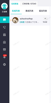

I'm tired of switching tabs.And I always forget the off-line users...
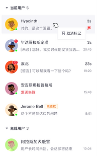
After: Lightweight high-frequency operations
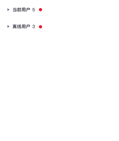
Use list rather than tabs, no longer click to switch. Clear overview for users in different states.

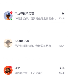
Badge & Mark, in case of omission.


💬3.Chatting area: Reducing visual noise!
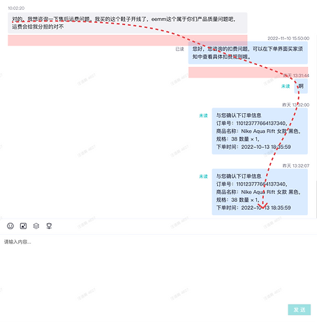
Before: Poor reading experience, visual clutter
2. "unread" text & timestamp are too eye-catching.
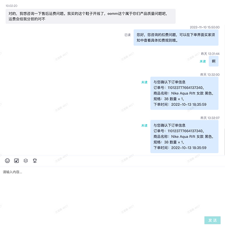
1.Poorly readable message flow
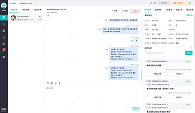
After: Reduce visual noise, improve conversation experience
1.Improve zoning, upgrade visuals.

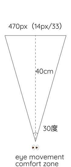

2.Limit conversation bubble width, readable message flow
3.Graphics instead of "unread" text, reduce visual noise.
4.Support area
Before: Information & functions scattered in 5 tabs
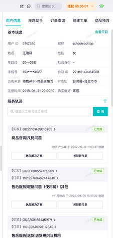

So many departed modules...I don't know where to go.
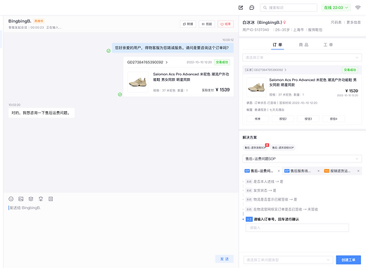
After: modules basing on 3 scenes, automatic positioning
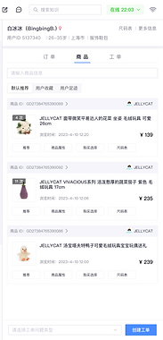
Based on different scenarios of pre-sales and after-sales, breaking down information and operations into 3 new tabs.Besides, automatically determine the type of problem, supporting automatic positioning.
Order tab
Product tab
Ticket tab

5.Overall
Before. Lack of intelligence
Can only repeat questions that users has already asked the bot

Repeating, repeating, always repeating...
Have to create work orders
every time
AFTER
Visual noise reduction, improve conversation experience
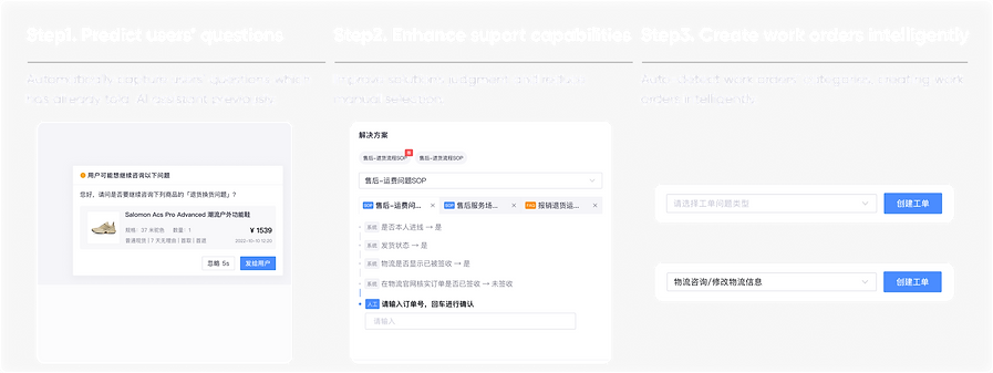
Design results: Improved consumer working efficiency in main touch points.
